
When it comes to accessible web design, dialog windows (also known as modals) are one of those tricky components that can either make or break a user’s experience. Unfortunately, website dialog accessibility isn’t fully defined in current WCAG or WAI guidelines, leaving developers to interpret what “best practice” really means. That’s where confusion — and inconsistency — often begins.
At Equal Accessibility, we often see websites that technically pass automated accessibility scans but still create confusion or barriers for real users, especially those using screen readers or keyboard navigation. Because website dialog accessibility affects both usability and compliance, it’s one of those overlooked details that can have a huge impact on overall inclusivity.
That’s why the recommendations in this document, A11Y: Dialog Focus Best Practice, are worth unpacking. They provide practical, experience-based guidance for handling focus inside dialogs — something the official guidelines still don’t fully clarify.
Why Dialog Focus Matters
A dialog or modal interrupts a user’s current workflow to present important information, confirm an action, or request input. Because it takes over the interface visually and functionally, focus management becomes critical. If you don’t control focus correctly, users can become disoriented or even trigger actions they don’t understand.
When it comes to website dialog accessibility, the goal is to make sure that every user — whether they’re using a keyboard, screen reader, or mouse — lands in the right place to understand the purpose of that dialog before interacting with it.
What Not to Do
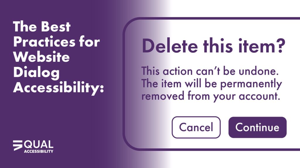
The first and most important takeaway from the Dialog Focus Best Practice document is this: Avoid automatically focusing a button when a dialog opens.
At first glance, this might seem harmless — after all, setting focus on a “Confirm” or “OK” button ensures that the dialog is keyboard-accessible, right? Not exactly. This approach creates multiple accessibility and usability issues:
- Misleading emphasis: A highlighted button suggests it’s the next or most important step, which can mislead sighted users.
- Loss of context: Screen reader users may hear “Confirm” or “Cancel” before they even know what they’re confirming or canceling.
- Unexpected behavior: Users don’t expect to land directly on a button when a dialog appears, which can feel abrupt and even lead to accidental activation.
- Broken reading flow: If the dialog includes instructions or explanations, starting focus on a button forces users to backtrack to understand what’s happening.
These problems don’t just frustrate users — they also reduce confidence in your interface and can make people question whether your website or app was built with accessibility in mind.
The Recommended Focus Pattern
The best practice is to focus the dialog container itself (using tabindex="-1") when the dialog opens.
Here’s why this approach works best for everyone:
- For screen reader users: The dialog is announced properly. They’ll hear the title and description before reaching any buttons or fields, preserving a logical, predictable experience.
- For keyboard users: Focus is contained inside the dialog, but visually, there’s usually no disruptive focus ring on the container itself. You can add a subtle visual indicator if needed to confirm that the dialog is active.
- When closing the dialog: Focus should return to the element that triggered it (like a button or link). This helps users continue where they left off without losing their place on the page.
Following this pattern ensures consistent website dialog accessibility across browsers and assistive technologies and aligns with how modern ARIA modal implementations are expected to function — even though WCAG doesn’t spell it out in detail.
When It’s Okay to Break the Rule
There are some exceptions. If the dialog’s primary purpose is data entry, such as a single input field like a search bar or login prompt, it’s appropriate to focus the first input instead of the dialog container.
This improves efficiency — users can start typing immediately without needing to tab or navigate — but context is still clear because the field itself provides it (e.g., a label that says “Search” or “Enter your email”).
The key is intentionality: focus should always begin where it best supports understanding and usability.
Why the Details Matter
The goal of website dialog accessibility isn’t just compliance — it’s about creating an intuitive, inclusive experience for real people. Poorly managed focus can make your product feel unpredictable or inaccessible, especially for users who depend on assistive technologies.
Think of it this way: every time a dialog opens, you’re interrupting the user’s flow. A well-managed dialog gives them context immediately, then offers clear choices. A poorly managed dialog forces them to hunt for meaning or — worse — act without understanding what’s happening.
That’s not just an accessibility issue. It’s a usability issue that affects everyone.
Filling the Gap WCAG Leaves Open
As of now, WCAG and WAI-ARIA guidelines give broad direction on focus management and modal behavior but stop short of defining exactly how dialog focus should behave. This leaves room for interpretation — and inconsistency — across the web.
The best practice of focusing the dialog container helps fill that gap. It ensures the title and purpose are communicated first, supporting both comprehension and confidence. It also prevents users from accidentally triggering actions before they’ve even read what the dialog is about.
That’s why teams focused on website dialog accessibility often go beyond WCAG’s wording — prioritizing consistency, predictability, and user comfort instead of relying only on technical compliance.
A Practical, Predictable Experience
At Equal Accessibility, we encourage teams to treat dialog focus not as a technical requirement but as part of your content and interaction design. You’re not just deciding where focus goes; you’re deciding how someone experiences a key moment in your interface.
When you handle dialog focus properly:
- Users know exactly where they are and what’s happening.
- Assistive technology users get essential context first.
- Everyone experiences your site as intuitive and consistent.
That’s real website dialog accessibility — not just compliance. By making it part of your design and development culture, you build digital experiences that feel natural and inclusive for all users.
Make Your Digital Experience Truly Inclusive
Accessibility is built one detail at a time, and website dialog accessibility is one of those small things that makes a big difference. Whether you’re updating your web components, training your dev team, or auditing an existing site, Equal Accessibility can help you create experiences that make sense for everyone.
Contact us today to ensure your digital products don’t just meet guidelines — they meet people where they are.